New Design, New Features, Premium Accounts Now Live!

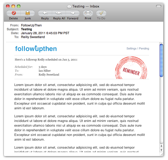
As you may have noticed from the shiny, newly designed followups in your inbox, the new version of FollowUpThen is now live!

While much has changed that you can see, there is just as much new that you can't see. These new "under the hood" enhancements
set the groundwork for us to make quicker and more efficient progress moving forward. It also fixed various bugs and improved general system
stability. In other words, we now have a solid foundation : )

Here are the highlights from our most recent updates:

Continue reading "New Design, New Features, Premium Accounts Now Live!"

New design & more coming soon!

We are on the verge of releasing our biggest update to FollowUpThen to date! Before doing so, we wanted to give you an idea of some of things we have in store.

New Followup Design

We've decided to clean up our followup message. After a year of use it seemed like a good time for a design refresh, both for style and function purposes.

We spent a lot of time working to get things just right. We did our best to limit the vertical space the reminder takes up. As you can see, we've removed the large post-it note in place of a smaller Reminder stamp. The new followup message is also a lot more readable and can be easily skimmed for the most important data about the message.

Continue reading "New design & more coming soon!"