With a new, minimal, mobile-friendly followup design, better calendar integration, email-based actions and a quick followup shortcut, we are happy to say that your inbox is about to be a better place to get stuff done.
Introducing The New Followup
First things first, we are happy to announce that the new followup design has arrived!

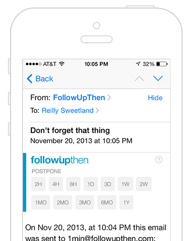
The first thing you may notice (other than it's on an iPhone) is how how much is NOT there.
This was our #1 point of feedback and our primary one goal – to get the reminder out of the way so you can focus on your email.
On larger displays, it reduces its vertical height by expanding horizontally to take advantage of the extra width – again, so you can have more space for your email.

The 'settings' and 'pending' links in the upper right has been replaced by a subtle 'help' button.
Even more drastically minimal is your new followup emails to others:

Where there used to be a big 'ol "reminder" stamp, logo, etc is now a plain-text email that comes from your name, with your email in the "reply-to" (so they can just hit reply to email you)
and a little footer that says that it was sent by FollowUpThen. We've tried to make the followup look as personal as possible while complying with spam-filtering rules.
Read more about the minimal template.
The Quick-Followup Button
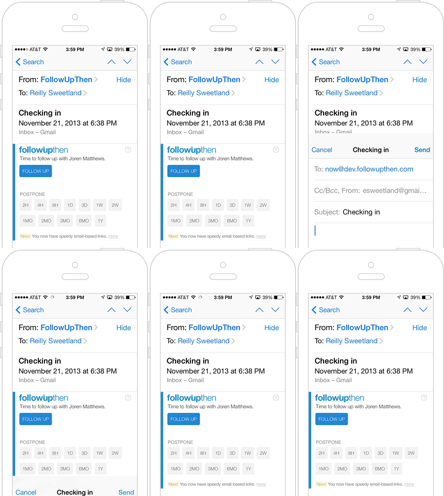
While a lot has been taken away, we did make one key addition, but only when your followup was scheduled via 'cc' or 'bcc' – a followup shortcut.
When scheduling a followup on a conversation with another person, many users complained that finding the original and re-sending it was a pain. Now, on your 'bcc' and 'cc' followup
reminders, you will see a blue "followup" button. This button lets you re-send the original email with a followup message in a snap.

The email that your recipient receives uses the minimal-style template shown above and appears as a personal followup message from you with the original thread below. Read more about email actions and the followup functionality.
Now wait a minute...you might be thinking to yourself "how does that followup button work so quickly? This is only an email. right?" Right..but with something special...
Email-Based Actions
Email-based actions let you perform actions on your followup without leaving your email. Instead of the button taking you to an external web page, it just opens
a new email message (pre-populated with some magic of course). On a phone or tablet, composing a new email is so fast that it makes the followup feel similar to a native app.
Postponing and following up (shown above) make use of this new action feature, but that is just the beginning.
Email-based actions are now provided as an option on your settings page. For now you'll have to manually enable
them. We will eventually be enabling this by default on all accounts. Read more about email actions.
Delayed Emails (Premium)
Note: Our delayed email feature has since been discontinued.
We are happy say that one of our most popular requests has now been completed and is available on FollowUpThen Premium: Sending an email to someone that arrives at a later date.
In keeping with our approach of "working on any platform", we decided to implement this as one simple line of text that is written as the first
line of the email. That way you can send a delayed email from anywhere: desktop, tablet or phone.
Simple delayed emails look just like the above text-only personal template. (Recurring and task-based emails use the FollowUpThen template.)
The New Interactive Calendar Feed (Premium)
There is one other premium feature has received a revamp: the calendar feed, which now has speedy email-based action links.
Clicking into an event, then canceling now takes only a couple of seconds, and you can do it right from your native calendar app.
This feature has been optimized for mobile calendars, but work on desktop systems as well (sometimes without the links). Read more about
calendar integration.
A New System Tour
Even if you are a long-time FollowUpThen user, it's possible you haven't learned about all of our features
...in fact, I am certain that is the case because we just added a new feature that you can only find in the tour!
Start the tour now to see find your hidden new feature – free for all users, premium and paid.
More to come...
This latest release had a lot of new features, but what we're most excited about is the foundation this puts in place, so keep an eye out for some more exciting and useful features in the coming weeks and months.
Thanks to everyone who gave their comments and feedback on these designs. As always, suggestions and input from our users play a role in helping us make FollowUpThen better.
Hopefully you'll inbox will feel a bit lighter now that there are fewer pixels in there.
So what do you think?